Foot Locker - concept 1

Inspired by @Joe Jordan designing a new Foot Locker logo, I have given it a thought and tried to come up with a concept myself. This is the first try.
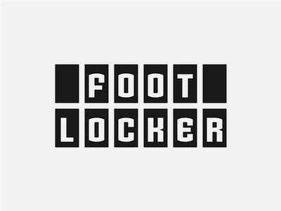
Concept:
The black blocks serve as a reminder of the black stripes
from the old logo, but also resemble lockers.
I decided to go for a strong, retro letter design.
It is inspired by an existing typeface but I had to design it
from ground up to have it pixel perfect and implement some minimal but necessary changes.
The first letter "F" also includes a "foot" in the negative space. As a small hidden meaning...


