Hop...

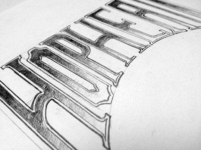
My first "professional" go at lettering for the label of a product I am developing with a coworker... it contains hops but it's not for a beer... it's something different. I think we'll be announcing on Friday... so stay tuned!
As for the lettering, I absolutely loved the "gradient inside letter" look of this shot by Joshua Bullock: http://dribbble.com/shots/276525-Quest
But we wanted a bit more of a rough woodcut feel and less ornamentation. Hint: This is a product for men. The logo and subtitle below this lettering should be done later in the week and I can't wait to show that off. More to come!
As always, I'm still learning lettering and would love any help or suggestions!


