Double Border

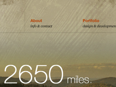
I've gone back to the top nav, as the scope of this site has changed significantly. I think the double dotted border feels better than the harsh shadow. Made this change per Matthew Smith's comment http://dribbble.com/shots/33664-kenseals-me-Navigation#comment-83737


