


feci.com re-design

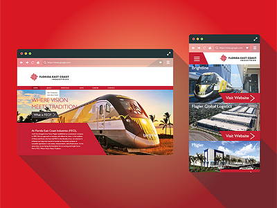
The Florida East Coast Industries website didn't just need a face lift, but be more accessible to its user base. The overall experience was broken and had ton of dead-ends, the content was too spread out, and several sections focused on listing facts about its subsidiaries, and read as if the information was copied from a brochure.
My first step was to identify the navigation pain points, and to examine all of the content available and determined a way to reduce a site hosting a minimum of thirteen pages to less. In response I improved the navigation by making sure every page would have a lead to another section of the website. More over I managed to consolidate all the information from those thirteen pages, to seven.
The next part was focusing on the new order of elements and content and how the home page could serve the user to take them to where they needed to go. The focus being explaining what FECI does as a company, and showcasing the subsidiaries as portfolio pieces to show the user a quicker grasp of what they do (with links to the websites if they desire to find out more).
By comparison to the previous website, The company's "About" page was condensed from three to a single page to minimize clicking. And the news and press release section is now better organized for searching purposes.


