Donut Charts

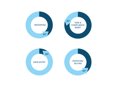
Challenge:
To visualize how much time our clients would save by using our application.
Idea:
If we use 100% as their total time working on these four day-to-day tasks, we would save them x amount of time. The graph I use would have to give a sense of time, savings, and usage.
Solution:
A donut chart being a circle feels like a clock and having the arrow go counter-clockwise made this chart feel as if you were going back in time by x%. By using a darker color for the time still spent and a lighter color for time saved, it almost makes it feel like we're erasing time spent doing something. Because circles are generally harder to feel out the amount of, I've included the percentage number so that the audience knows exactly how much time was illustrated in the charts.


