Brandboom Button Guidelines

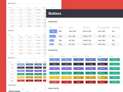


Brandboom is a huge platform with lots of different actions for users to take and feedback for the system to deliver. We developed a button set for the app that should meet every need we could have, and includes animated feedback right in the buttons themselves. We use the solid buttons the most, which should be easily recognizable and provide high contrast against any base color in our dashboard. Our "Default Buttons" are used for secondary actions, and the "Link Buttons" are used for any subsequent actions.
The button icons are used for 2 reasons. Label icons are placed to the left of their descriptive text, if the button is meant for navigation. Action icons are placed to the right of the text, if the button is meant to perform some action. Pretty robust and still pretty easy!


