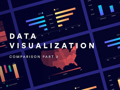
A Guide to Data Visualization - Comparison Part 2


After about 6 months, through lots of laziness and multiple sessions, the 2nd part of Data Visualization for Comparison is here.
The world has got a shit ton of data, and nobody has the time to go through it one row at a time. In order to make huge sets of data consumable, we need to present it in a much simpler format. This is an attempt to create a guide for designers all over the world that would guide them on various ways of visualizing complex data.
Check it out Medium and Behance.
Shoot your feedback in the comments, and don't forget to press "L".


