Root Insurance Co Header Exploration


Here in Columbus we have this awesome company called @Root Insurance Co. that's turning the car insurance industry on its head by putting design at the forefront of everything they do.
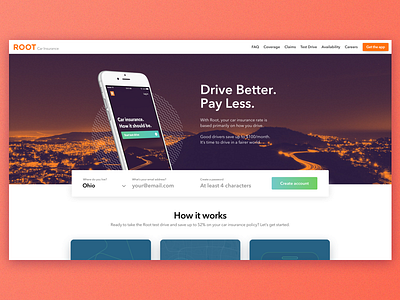
Their work is amazing but I noticed that their homepage header currently has a large signup form taking up the majority of area. It's not bad to have a form above the fold by any means, but it does present a large point of friction as soon as users arrive at the site. They've just gotten there and they're already being asked to fill out a bunch of information.
I started to wonder what it'd look like if the form were presented in a more airy, less intrusive way. Still above the fold and the main CTA of the page, but just a little less "in your face".
Let me know what you think! Check out the before/after in the attachments.
Oh and @Root Insurance Co., if you feel like chatting about that open Product Designer spot, I'd be ok with that ;)


