Product card for In House V6


Product imagery always has been an issue for me. Quite often it is an inconvenient part of the product page — controls to switch among images are too tiny or buggy, images too small or too big, waiting time to load large size pop-ups is too long and so on. So when it's come to design such functionality on my own I try to experiment and see the results coming out from these tweaks.
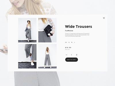
For this variation, my goal was to try something new and still stay within boundaries of the typical mental model for the product card. We already have used to the medium size image preview and a few small thumbnails beneath it but is it the most convenient way to showcase the perks of the product? Honestly, those tiny thumbnails I find irritating quite often. In the same time, I know many people are fine with that because they encounter such layout almost in every online store so it has become a standard layout. However, some brands did a great job making a difference. I was stunned by the H&M implementation of the imagery for the product page. Basically, their approach was an influencer for this version of a four-image grid with enough size to see what's on these photos and optional to click to enlarge the image to the full-screen size. I think it allows to have a grasp of the product from different angles or surroundings at the first size and invites to investigate details only by choice. What I really find fascinating here is that this could fit into conservative believe about the product page because the change is tiny since not every brand are willing to rely on ground-breaking solutions.
What do you think about this layout for the image section? Have anyone tried something similar? Let me know your thoughts in the comments below 😉
P.S. Real size in the attachment. Have a look!
* * *
Follow for more design stuff and not only on
Behance • Twitter • Instagram


