Workday’s Native Home Redesign


I recently had the privilege of being apart of the redesign of Workday's native home experience.
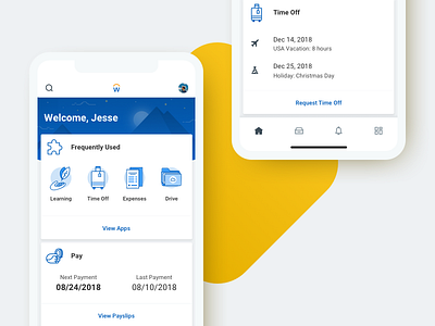
Originally, the experience was a static screen of "apps" that a user could choose from. Now, we're beginning to surface meaningful data to users (through a brand new card UI) that allows them to quickly navigate tasks and apps.
We've also introduced the familiar paradigm of bottom navigation. This allows users to navigate between the card feed, inbox, notifications and the original Workday app home screen.


