Photoshop 6 Icon

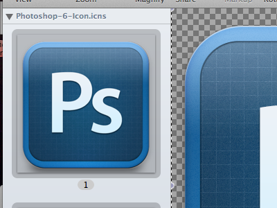
Okay I'm adjusting based on feedback from David. Do you think I made the center too dark? I used linear burn, which I personally like but I guess it isn't realistic for shadows though I like the burned effect.
I updated the texture inside and made it darker at the same time.
Here's the updated PSD (messy layers)
http://kzr.me/16403N1p0D3f100K3s3S
I think I really need to change the highlight to more of an iMessage on the top. I'd love to hear more feedback