Ecommerce brand card


Recently I've been keen on minimal style a lot and this shot confirms that 😀
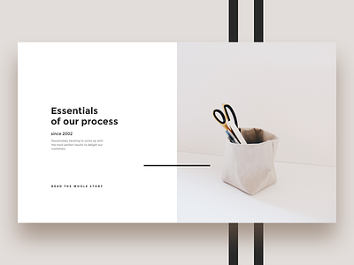
This shot illustrates what I call "brand card" — a section for an online store to tell some specifics about them and their values. It's going to be a part of the e-commerce kit as several other alternatives for the brand cards.
What I find catchy in this layout is a dark stripe that makes this layout way more interesting biding text and image even more.
It's fantastic how such a tiny thing can change the whole perception of the design piece.
What do you think? Is it a good way to use stripes and lines to show stronger connections between elements in terms of visual hierarchy?


