Cascade Hop...

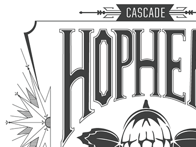
Very close to a first test print of the label, adding ornamentation and visual detail to keep playing up the old-world-signage motif. Now that I see my hand-lettering in vector form, I keep thinking there is something "off" about the kerning between the P and H. I think they're too close together. Also, Is the ornamentation on the top (next to "Cascade") too heavy? As always, helpful comments and suggestions are welcome!


