Complex Responsive Symbols: Fill Card Library


Part 02: Fill Card Sketch Library
Download Sketch Library
**The Anima Auto-Layout plugin is required for this library to work correctly**
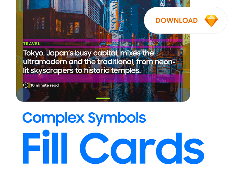
The challenge here was to create a universal, responsive, modular "card" in Sketch that could be used across multiple product lines. This was truly a pain in the ass to figure out but ended up setting the foundation for the rest of our responsive module library. Beyond the basic requirements of being "responsive" and allowing product/design teams to drag n' drop modules to create new layouts, we set a few more reqs below:
A. Support multiple colors from the design system
B. Support multiple icons for the timestamp component
C. Support optional video icons
D. Support photo and solid color backgrounds
E. Support rounded and square corners
F. All text fields must be editable
This module leverages multi-nested stacks/symbols via the Anima plugin. Comment if you have any questions or have suggestions on improving the module.
-------------------------------------------------------------------------
😊Part of the Uversa™ Design System


