Mort Modern

In January I debuted my largest typeface yet, called Mort Modern. Inspired by the mid-century lettering artist Mortimer Leach.
Mortimer Leach was a lettering artist who passed away 40 years ago, but I found his work in mid-century advertising lettering very inspiring. As part of the project I have researched and assembled the first biography of his life.
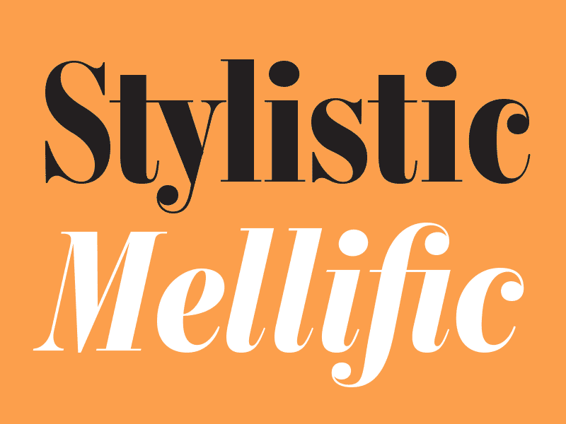
The family of fonts can be used in editorial settings to typeset an entire magazine, cover-to-cover. Taking inspiration from Mort's mid-century Didone lettering, I have drawn variations for use in everything from text to headlines.
The range of 56 styles in Mort Modern Pro includes italics, a condensed width, and 3 optical sizes. I enlisted the help of my friend @dan gneiding to show them off in a series of card designs that will be shipped to the door of anyone who picks up a license.
I was honored to get in touch with Mort’s surviving daughter, who in her early 70s was kind enough to give me her blessing to pursue this project. She also provided invaluable details about his life that couldn’t have been read in any book or article.
Check out the mini-site here!


