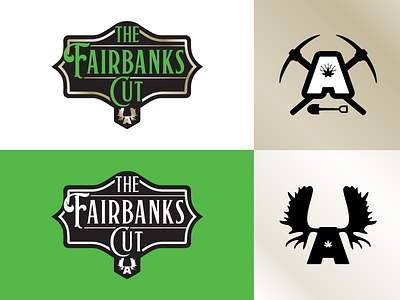
Dankorage - The Fairbanks Cut - primary & secondary logos

As Alaskans get more and more comfortable w/legalized marijuana, the industry up here is spreading and expanding into areas across the state.
Dankorage's first expansion / "satellite store" is the city of Fairbanks. Wanting to incorporate the "Dank A", they also wanted a design that paid tribute to Fairbanks gold rush era, and its frontier-like status. The gold gradient on the upper-right is to represent a gold foil when things start getting printed.


