Two Cents
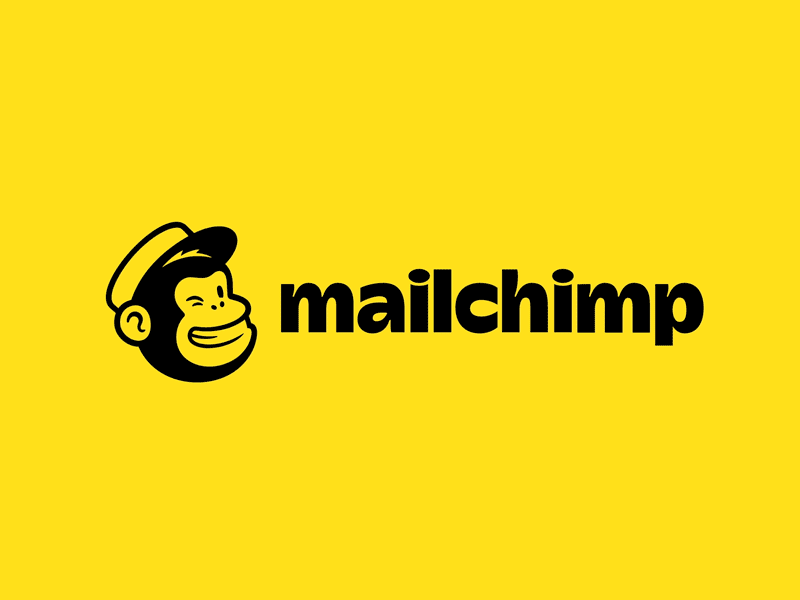
Nicely done @Mailchimp! I think your decision to use the Cooper typeface for text copy is quite inspired. Why not continue its refined, yet approachable nature into the wordmark as well? Cooper has always had a restrained whimsy about it, that I think will serve your brand well. Also while the yellow is quite striking, is there a conceptual rationale behind it? One last thought would be pairing a complementary color to the yellow fields that could better harmonize your modern and helpful brand we all love.
Posted on
Sep 28, 2018
More by Stadler View profile
Like


