Yani Finance Logo


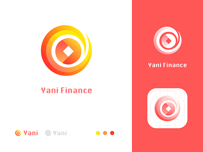
Hey guys, here is the logo i designed for a financial company called yani, in this shot i try to follow sunny's logo design format.
I used two bright color to add vitality to the brand. The logo is a combination of two shapes, a coin and a hand/wind. I made the logo a little sharp to make it look like metal material. The meaning of the logo is that try to adapt to the need of society and make the money useful. Hope you like this shot!