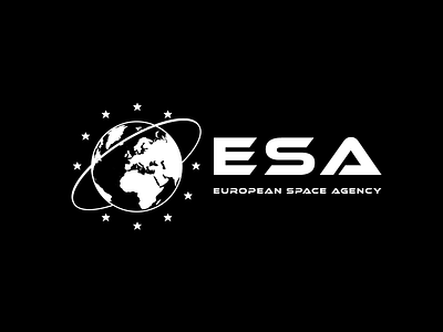
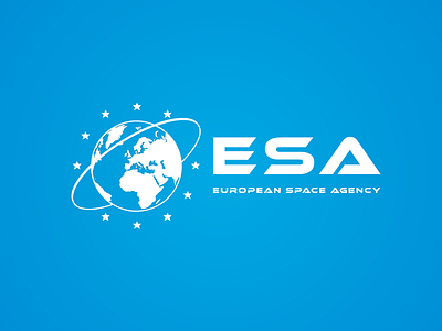
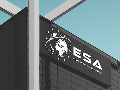
ESA (European Space Agency) Logo Rebrand
Currently the European Space Agency uses a logotype for its branding. ESA has poor recognition amongst the general public and is often confused with the European Food Safety Authority.
My solution would be to create a Iconic image that could rival NASA for its branding for use as a logo and as a flag.
My concept was to have Europe in a globe surrounding by stars with a angled orbit going from the northern hemisphere to the southern hemisphere. I used Ethnocentric font for the lettering.
agency
agency branding
brand identity
branding
concept
design
europe
galaxy
government
identity
logo design
logo modern
nasa
orbit
outerspace
rebrand
simple
space
website
View all tags
Posted on
Oct 18, 2018
More by Dermot McDonagh View profile
Like


