KitchenPal Recipe Page


I decided to take a little break from working on my personal site and revisit the design for the KitchenPal recipe page.
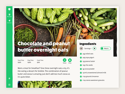
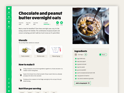
Whilst I think the previous design was stronger visually, I think this design is much stronger overall.
This brings a lot of the important information up the page and puts less focus on the image. Whilst the image is important it's meant to be more of an aid and then get out of the way once the user has decided this is what they want to cook.
Also having text on top of the image introduced accessibility problems – it's always going to be harder to read text on an image compared to a solid background.
With the image being so wide, it also meant important information in the image could be cut off depending on the user's screen size.
And lastly, from a content creation point of view, I'd only need a single image that could be used across all devices and social media.
I'm just a brainstorming ideas here, but going forward I'll be working with @Kev Simpson on a new version of this project.
It's a project we've both been interested in doing for years and with his technical knowledge we can push features even further.
Need help with your project?
Get in touch 📮 hello@robsimpson.digital