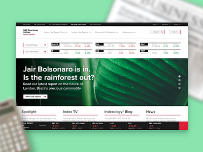
Daily UI 003, Landing Page
That's not a real headline from the S&P site. I hope you don't mind my sassy political commentary :)
At first, I was going to design a landing page for a consumer product, but I thought information as a product would be a bigger challenge. I decided to redesign the S&P 500 site (https://us.spindices.com/). I took some elements from the global site (bottom bar) and redesigned most elements on my own.
Understanding the hierarchy was a bit tricky. People are here to see how stocks are doing—but S&P is clearly trying to define themselves as the thought leader in this space.
Ultimately, some elements (like the stocks at the top) wouldn't work the way they're designed. But this was a great exploration and I learned more about the design decisions made when showcasing stocks, and how to better handle mega-navigations.
Photo by Taneli Lahtinen on Unsplash


