D


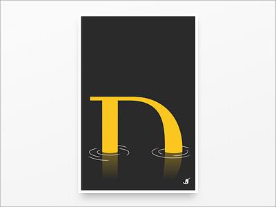

D is for Dip - Playing with the nautical theme of our company name, I used a classic font (Bodoni Book) D which, starting at baseline, slowly dips into a semi-viscous liquid at night.
*This submission is from the DY Alphabet design challenge our design team created. Each of our designers was randomly assigned a letter in DockYard to create a poster. The rules were simple: design a poster that “represents your letter” given specific parameters (size: 24: x 36”, colors: yellow (#FCC71F), black and white).


