Italian farfalle packaging

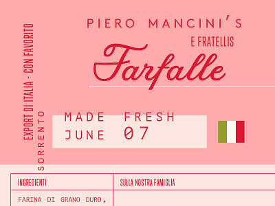
One of my favourite types of personal projects involves re-imaging packaging that is influenced by a particular place or time period. Whether this involves picturing a crumbling roadside in Sicily with lemons being sold in old crates under a weathered olive tree or even imagining how cheese may have been packaged for a petite crèmerie in a sleepy French town. When you really think about it it’s pretty amazing how the right combination of colours can truly capture the spirit of a certain time and even allow people to feel nostalgic for an era that they were never a part of. — A personal project from the Summer which I can hopefully revisit again soon!
Need help with your branding project? Enquire here.


