Logo evolution


Hey Dribbble fam!
Times are changing and it's only natural, or even necessary to evolve with time. Rather than shying away from change, we've learnt to embrace it and have started applying that acceptance to our brand. Our old logo was over 5 years old and quite honestly - we have not put a lot of thought into it, so what better way to start the change than freshening it up.
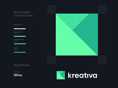
What we wanted for our brand mark was something well structured, sharp and simple, using most basic shapes that introduce depth in some way - something our old logo was lacking. Altho we initially entertained different approaches, late in the process we've decided not to lose the letter K, rather make it not as obvious.
Since we're never satisfied with out of box solutions (not to be mistaken with outside of the box solutions), we've decided to use a modified version of Gilroy typeface for our wordmark. If you're familiar with this type, you'll instantly see these small yet meaningful tweaks.
Next up - our website! Happy to hear your thoughts.
Press ♥ for l’amour and catch ya’s later!
--
Let's work together!


