Polaroid

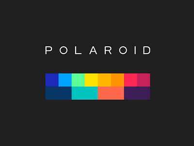


Work done in 2016 as acting chief creative director of their digital efforts. It was a complete honor touching this logo! Here we've moved the Polaroid logo away from Helvetica (used during its decline in the post Edwin Land era) and more toward its News Gothic origins. The Polaroid Rainbow was modernized to include adjacent colors in shapes that reflect both the original square polaroids, and rectangular mobile screens.
View the full brand doc: https://www.dropbox.com/s/2tna6ulcpky5hnw/Polaroid%20-%20Brand.pdf?dl=0


