GreenChoice - Logo (re)Design Concept

GreenChoice - Logo (re)Design Concept.
Greenchoice is the largest energy provider in the Netherlands that exclusively provides green, sustainable energy. All power and gas supplied by Greenchoice is durable. For example, they only use power from local sustainable sources and they plant trees to compensate for all gas emissions. They exclusively provide power from Dutch windmills.
*Decided to re-upload this to avoid confusions in concept and best way it can be implemented online and on print.
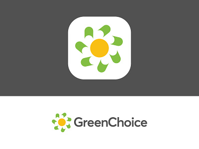
I tried to capture the main important elements which refers nicely to what GreenChoice stands for:
1. Nature (flower: negative space)
2. Wind (windmill energy rotation)
3. Sun as a centered element (with subtle glow)
Happy to hear your thoughts on this concept! All feedback is welcome at this stage.


