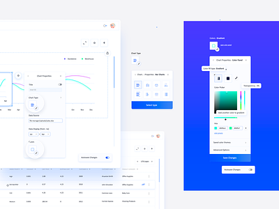
Chart Properties : Color Panel (Business Analytics Application)


Oh hi 🙋♀️, and a chillax Monday to you!
Missed my long potato posts 😀? Good.
Today I'm sharing a project piece that I was crazy about, and one of my most wonderful collaborations which, unfortunately, because of lack of resources and other reasons, it never got to be implemented.
(full view in the attachments)
It has happened to me, as I am sure it has happened to many of you, to go above and beyond in creating the best possible experience for our user personas and after many reviews and discussions, the project either becomes tinier or completely abandoned.
Happily enough, nothing that I have created so far, implemented or not, hasn't been somehow useful later on or at least thought me a bunch of new & great things (so let's drink to that 🍻).
About the project/company:
A complex family of products that allows business users to collaborate and create personalized dashboard views and storyboards. The most amazing thing about their main product is the fact that you can use any kind of data source and transform it into data visualization.
One of the many challenges:
Being an enormous application, with multiple enterprise packs, dozens of screens and hundreds of features. the list of things that had the potential to improve was infinite, so I won't be talking about my whole experience, instead, focus on this Color Panel (soz :D). This is a half-fictive scenario.
Initially, when I created the Color Panel, knowing that most users preferred either to select pre-made color palettes for their charts or create customs ones, I was blown away about how far we could push the usability, and suggested a very advanced control panel (a big selection of color palettes, color lists created by the user, search bar, sharing options, etc). That was the best approach to solving the user's needs, considering that all settings would be applied to the whole dashboard, and not just one specific visualization/chart.
After a closer look and another series of surveys, we found out that users were frustrated because they weren't able to manipulate charts individually. Not only that, but it was also revealed that the advanced settings were only used by 40% of users who were either just more curious than others, either had some experience working with advanced web tools.
Solution:
Instead of having one fixed panel that would control all elements at once, I took the general settings tool/idea and applied it to individual elements. By doing that, I achieved two things: give the A group users the freedom they needed and self-explained options, and B group users their most wanted advanced settings.
----------------
Ta-da! What would you have done differently?
Constructive feedback is always highly appreciated, that's why we're here!
Related screens from the same project:
Project Portals
Storyboard
Data Source
Chart Properties Original Shot
----------------
We are available for projects
Estimate your project at teamuinugget@gmail.com


