Line chart component

OpenTable's GuestCenter Business Intelligence Suite offers multiple reports and analytics for restaurant's to manage and track their performance.
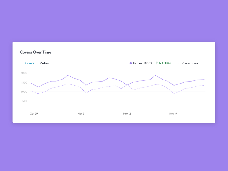
We like to reuse charting components throughout our reports for consistency and ease of use. Here you see our line chart in play - a handy chart that's great in displaying longer trends over time and comparing historical data.
Stay tuned for more charting components in the new year!


