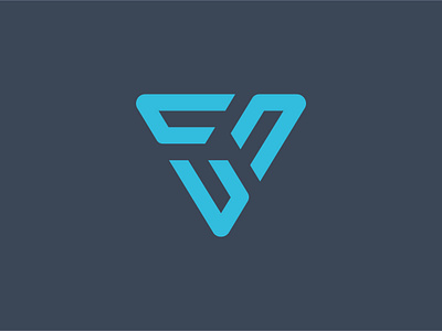
VC Logo Revised


The client wasn't overly keen on the first marque for this project, so worked up some more concepts and this is my favourite from round 2.
The company is called 'Venture Company' and the idea behind the marque is as follows:
The symbol is made up from custom V characters aligned inwards to make up a C shape taking the first letters of the company name. Each V shape is designed to represent a brand or idea the company works with and by bringing them on board the company transforms them from an idea through to a profitable business.