Boost Mobile Re-Brand

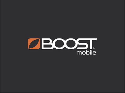


The current Boost Mobile branding seems dated and out of touch; based purely on aesthetics and surface-level targeting. Their logo lacks presence and maturity, presenting the Boost name in all lower-case lettering and displaying a less than ideal graphic arrangement.
My re-brand focuses on advancing the brand formally and conceptually. By treating "Boost" with a more dominant and custom typeface in all caps, this takes advantage of the power and simplicity inherent in their name, and leaves the symbol as an accent rather than a plea for significance. The former symbol was said to represent "motion" and attempted to align itself with key brand words like "Bold", "Gritty", "Youthful", "Urban". The new symbol throws the dated key-word model aside and focuses on philosophy instead - it represents the intersection of lifestyle and value.


