Orgrab Branding Design
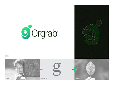
New branding for Orgrab, is a young organization with an ambition to make some noise in the agriculture industry. The meaning "Orgrab" is organic + grab.
The concept of the logo is "a man hugging leaf" in letter "G", That represents the love that organization having for the agriculture industry. also, I used a green color to give an organic feel to the brand.
Please share your valuable comments moreover saw your love by pressing the like button, thank you! DM For inquiries.
Posted on
Feb 18, 2019
More by Mihir Bhavsar View profile
Like


