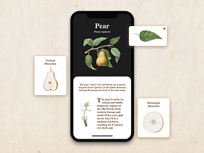
Pear Botanical App UI

2019 is the year of gradient in UI design. I'm getting increasingly saturated with that style now. Everything I find online is the same boring spin of gradient colors and deep black shadows. I miss the textures and the dexterity in design. I was super fascinated as a kid with pencil color illustrations of just about anything - vegetables, portraits of old monarchs, weapons and what not. It's been a while since I got to see something like that online (with increasing number of #ProCreate illustrations made on iPad). . Making this was a breath of fresh air for me - and if you're like me, tired of looking at similar kind of cookie cutter UI, here's something for you. Keep creating something that challenges the trend. Don't be a cookie cutter designer.
Please comment how you feel about this design! 🤗🌿


