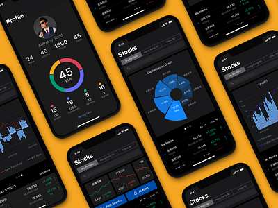
Stock Analysis App UI: Light Theme

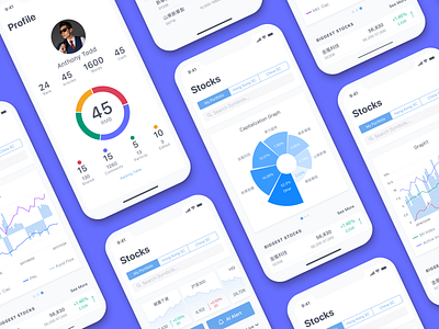
Time for some serious stuff: here's another glance on a mobile UI redesign project called Bitex. It's a stock analysis app for Chinese users. We've already shown you the dark theme before and today see it in the light skin. By the way, the client couldn't choose between them and kept both themes in the app so that users could choose by themselves. Which one would you prefer?
In case you want to learn more about the challenges and solutions of this project, welcome to check the detailed UX design case study. Stay tuned!