


Arabic vs English in Design


Hey friends!🏀
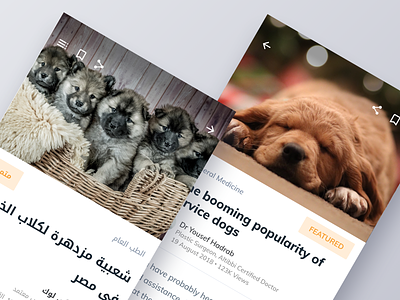
During our recent work on Medical News App we had to put big focus on how it will be displayed for majority of users who use Arabic.
It may seem like an impossible thing to design content for Gulf Region in English, if you follow some basic steps it's not so hard.
Key points You have to remember that Arabic is read from right to left, so your app screen will be a mirror reflection of your design. It's super quick to work on it in Sketch when you just make a copy of your artboard and re-align layers and groups. However it's not everything that will be mirrored. Photos for instance or some icons will look the same on both platforms. Rule of thumb is that you mirror only directional items, since text & navigation are mirrored.
Another thing is to pick a good font. Best there is comes from Google. Their Noto Kufi scales very well, and maintains those joints between characters very nicely. Sadly it only comes it 2 weights.
Another thing is to maintain same font sizes & paddings. But you have to accommodate for much, I mean a lot bigger line height in Arabic fonts compared to English ones. Naturally everything will be longer there.
For more info check out this amazing article by Anna Rubkiewicz
Also check out full pixels attached.
Please, let me know what you think!
Press "L" to show some ❤️!
Be sure to check out Behind the Scenes
We're available for new projects: office@visualpanda.com


