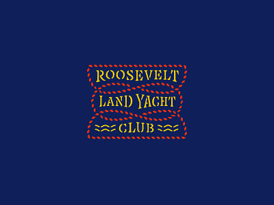
RLYC Logotype

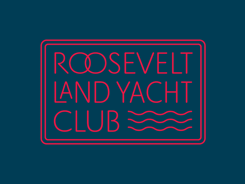
One of the most difficult logotypes I've worked on for being so “simple”. Spacing / drawing this bad boy was a monster. I drew each letterform inside their respective glyph then pieced together the logotype as components within another glyph.
A truly hybrid lettering/type design piece because each line needed different character widths and completely unique spacing all the while needing to feel cohesive and uniform. Ah what fun!