Slack Homepage Redesign Concept


Hi all! It's been a while, but getting back in the saddle here...
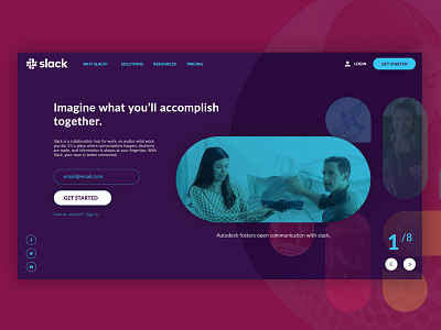
Here's a concept for the Slack homepage above the fold. The idea behind the design: Well, to start, we wanted to see if we could get away with an overall darker design with the dark blue background. For the actual design, we wanted to accomplish two things - 1. Introduce the product with an immediate call to action to get the user into the sales funnel (lead capture) - achieved with the text and micro-form on the left side, 2. Validate the slack brand itself by highlight some of the high-profile clients using the product - achieved using lifestyle images clipped in the slack logo, with the active "carousel" item displaying a small bit of text explaining how the company uses the product. Using the next and previous arrows, the logo would slide up/down, left/right and bring the next "piece" of the logo into focus by adding full opacity, a drop shadow, and increase in scale.
Let me know what you think of it. Happy Wednesday!
--
Stay connected with Rise:
Facebook | Instagram | Twitter | Pinterest
--
Looking for Design? Development? SEO? Marketing? Contact Us.


