Motorious spacing

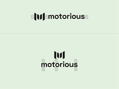
Here are the clear-space guidelines for the Motorious logo.
I was always taught to have a reason for every design decision I make. I found that the lowercase "s," in the name, gave the mark and wordmark a perfect amount of whitespace.