Craft + Commerce Conference site update


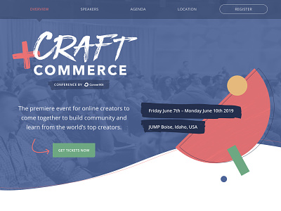

I've been using curved lines and organic shapes a bunch lately in my web designs, and this was the page that started it all!
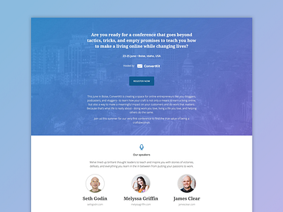
In redesigning our conference website I wanted something that felt more organic and friendly than the previous site I designed 2 years ago. I was tasked with doing a "lightweight reskin" so I tried to keep most of the HTML elements and overall structure of the template the same, but I definitely added a bunch of new stuff to it too 😬
Overall I'm really happy with how I've applied our new company brand to the conference. It feels separate, but still very connected. I love the organic shapes and textures that help the geometric 'confetti' shapes fit in with the sketchiness of the conference logo. Lots of room for improvement of course, but for now this is what we'll stick with.
Wanna come to the conference? https://conference.convertkit.com