Humanist

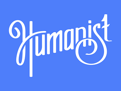

This is my first attempt at hand-drawn lettering. This is for a t-shirt design. Overall I'm pretty happy with it but it needs work to make the letter forms more consistent and to get the visual balance between figure and ground right. I think the strokes probably need to be thicker and the negative space larger. The "UMA" gets a little bit too tight.


