It's got what plants crave

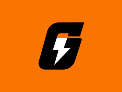


I saw @Allan Peters nice take on the Gatorade icon a few weeks back and thought it was really interesting the options that he was exploring with the 'G' and the blot. When I came across @Charlie Coombs (https://www.instagram.com/p/Bv7isxxh1y6/?utm_source=ig_web_button_share_sheet)the other day I had to see if there was a way to get the blot into the negative space. By using a blot closer to the current logo and italicizing the 'G' made it more dynamic and sporty. Playing with the negative space also provided a 'fully charged battery' visual.