Lowercase g with beziers

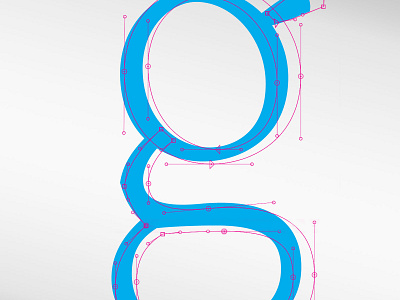
Starting to work on my bold and light weights of the fonts. This is the light version of my letter g. While it is difficult to tweak these shapes making the g lighter was easier than when I was making it bold.
Starting to work on my bold and light weights of the fonts. This is the light version of my letter g. While it is difficult to tweak these shapes making the g lighter was easier than when I was making it bold.


