Light vs Bold Italic

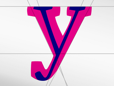
It's always interesting to see how letter shapes change between weights. I thought the y was a great example of how letters need to be adjusted to meet the requirements of their size. Most people think it is just the shame shape thinned out. But optical adjustments need to be made so the same visual spirit is maintained across sizes. ⠀


