Wunderlist Iconography 2019


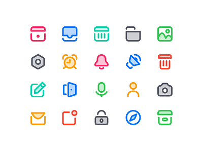
I was always a fan of the Wunderlist iconography. I think the style is just beautiful and every pixel sits in the right place.
Since I saw this tweet I couldn't get this out of my mind how Wunderlist could look today.
Now here I am...with some icons...the lines are a bit thicker...now 2px instead of 1px and the colours are a bit brighter.
The final mockup feels like a hybrid of Wunderlist and Things but I guess thats not a bad thing :-)
__________________
UPDATE:
You can find a further exploration of the icon style here


