Google Calendar Redesign
Rethinking @Google Calendar's UI ✨
Being such a crucial tool to organize our lives, I decided to study Google Calendar and identify multiple problems & small inconveniences of using the utility. On Twitter
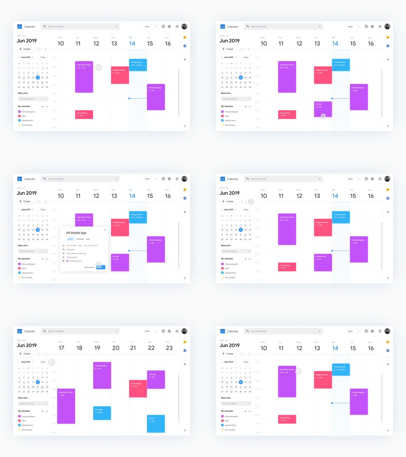
🔍 I kept the search bar shown by default on the top (consistent with most Google products), while moving information about the timeframe on the top left, which is now more prominent.
👀 I also moved the arrows to switch day/week/other next to the "Create" button, which now make sense in context & stand out by being placed right over the fold.
🕒 Another issue I wanted to tackle was how hard it can be to visualize the calendar when travelling & working from different locations, by adding the timezone on the top left which can be changed through the dropdown, without having to access the settings.
📅 I slightly changed the calendar to make it more intuitive by placing the arrows to change month around the label (I often confused them as arrows to change weeks/day/other, due to their placement & not being in context), and placing the button to go to the current day right next to it, making it way easier to spot.
🐤 Aside from that I added a "bird's eye view" of the events throughout the month through small colored dots in the different dates, and highlighted the current timeframe that you're visualizing (oddly enough I've also been confused by that in the past).
👋 I am currently open for opportunities, contact me at hi@alyssax.com


