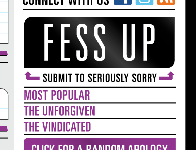
Close up SRSLY SORRY right Nav
Working on the sites personality, colors, and interface. If seriously sorry were a person, he would be blunt, abrasive, and callous, but all together hilarious, and at times genuinely nice. Hmm.... still working on the personality thing. Purple and black seem appropriate for a "sorry" site. It's like a punch in the face. The interface simply needs to draw readers to interact. What do you think....?
More by Shaun Lind View profile
Like


