Salsero Caps


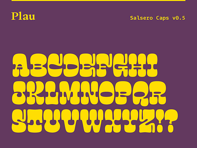
This is the first pass for the caps of Salsero. There have been so many learnings, it's like the typeface speaks to the designer to say how it wants to be. There are many rough quirks that I need to address in the next steps. Right now, what I see is the potential to be used really large, toned down by a sans for example. There are some moments where the letters either have to leave or for some reason left the pattern or overall style behind. The T, Z are cases in point.
If you'd like to try Salsero in a project, shoot me a message via rodrigo @ plau.co.
While you are here: https://fonts.adobe.com/foundries/plau – you can sync most of our fonts via Adobe Fonts, it's unlimited and free if you already pay for Creative Cloud itself.


