The Value of Europe

On September 18th, 2012, former German Foreign Minister, Guido Westerwelle, arranged a conference emphasizing the importance of embracing Europe in trying times. Supported and broadcast by Arte TV and Deutschlandfunk, the symposium, appropriately titled The Value of Europe, set out to paint a positive, yet realistic picture of European identity and unity.
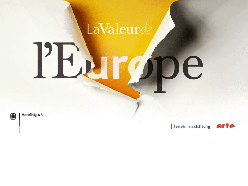
Lucid was approached by the Bertelsmann Foundation to create a visual identity for the conference. Like the forum, the branding needed to represent the idea of European reinvention in a subtle yet powerful way. The concept began with a photo of torn paper; the physical idea of unwrapping layers, symbolized the theme of breaking through to a better future for Europe. Unanimous acceptance of the idea, and a short timeframe led to an extremely succinct design process. Working from the original concept photo, along with designer Sam Oswick, two fonts were created. On the exterior layer, a more traditional typeface, tearing into the interior and exposing modern, bold lettering. The golden color was chosen, in contrast to bureaucratic blue, to give a warm feeling while still alluding to economic value. In the end, the visual was designed in German, English, and French, and adapted to backdrops, signage, programs, bags, folders, pencils, notepads, and even a paper clip.


