Work Hard. Play Hard.

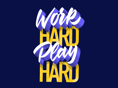
I’m working on a mural for a wall we have at Itnig’s office. Right now I’m testing different styles and color schemes, along with possible messages.
The text tool in Procreate, although it’s not super powerful, has given me the chance to quickly incorporate typography to combine with the brush script style to create more contrast.
What do you think about this piece? Did I made the 3D effect too big? Is the color scheme good enough?
I'm not that sure on the contrast between the flat typography and the 3D effect. I kind of love it but I don’t know if I’ve been working too close to this.


