📱Icons UI Animations

The concept was originally created for an Uplabs Icon Challenge, but I completely forgot about it and got reminded of the project just recently. My initial idea was to create a simplistic grayscale icon set, but then another thought struck me:
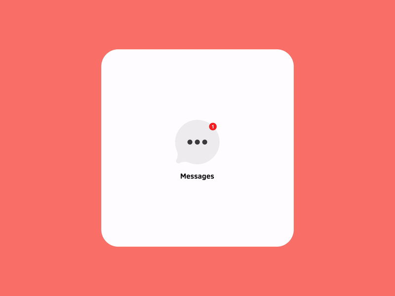
Is there a way to amplify the interaction in terms of the app notifications? Today we are used to see a 'red-dot-reminder' popping up just next to the icon, indicating that we got a new notification or that we have a missed call or message, waiting for our response. It's super effective and draws attention as soon as it pops up. But what if we added just a subtle animation to the icons, making a more complete and immersive experience? What do you think?


