San Francisco Logo Concepts

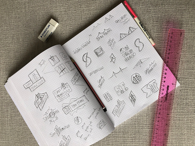
🤩 Often you just see the final result of a project, never the process or behind the scenes of how the designer or artist got there. So I wanted to give you a quick look into the process of designing San Francisco’s new logo and just how many ideas and logos were explored. (Much more than I was commissioned for to say the least, but when you get such a high-profile project that’s what you do right?!)
Watch a video BTS on my Instagram:
https://www.instagram.com/p/B0pLTn3gFwG/
Everyone has their own process and there is no right or wrong way. For me, I start with mind mapping, then do rough sketches and then jump on the computer to start to experiment with the ideas, combining type, color, iconography, photography and more. I then get to a shortlist, see how the logo works within a brand system and in context of uniforms, posters, cards, etc to validate the idea and to see if it is the right solution to the brief.
This project was a collaboration with Miles Partnership and other designers were contracted for the project. After submitting my initial drafts & a few rounds of revisions, I was stoked to learn that my design got through to the user testing round which meant it went through testing in 20 US states and 3 countries. And I am humbled to say, that my logo came out on top! :D
The process did not stop there though, there is a 100+ page brand guidelines booklet that Miles developed that goes along with this refreshed brand! More can be seen in my portfolio:
https://justcreative.com/portfolio-item/san-francisco/
If you haven’t already, you can watch the branding process video on Youtube: youtu.be/BQi3uNGV_CE and find more info on the SF Travel site: sftravel.com/media
What are your favorite 3 SF logo concepts?